
No team of Salesforce developers and admins wants to waste unnecessary time and effort on releases. Less time spent on deployments means more time building new features. Fewer deployment failures mean more frequent releases.
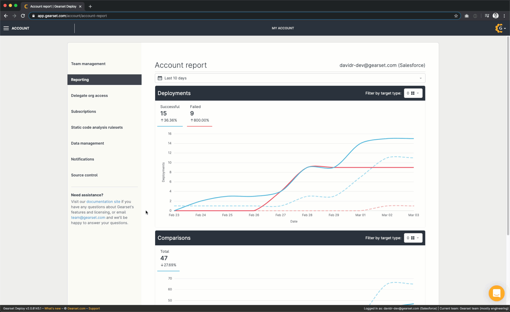
If you’re already using Gearset, then you know from experience how much time and effort you’ve saved. But by how much has your release cadence increased? Are your deployments getting more reliable? Is your team still improving? We’ve added a new Reporting page to Gearset, so that you can track your team’s progress.
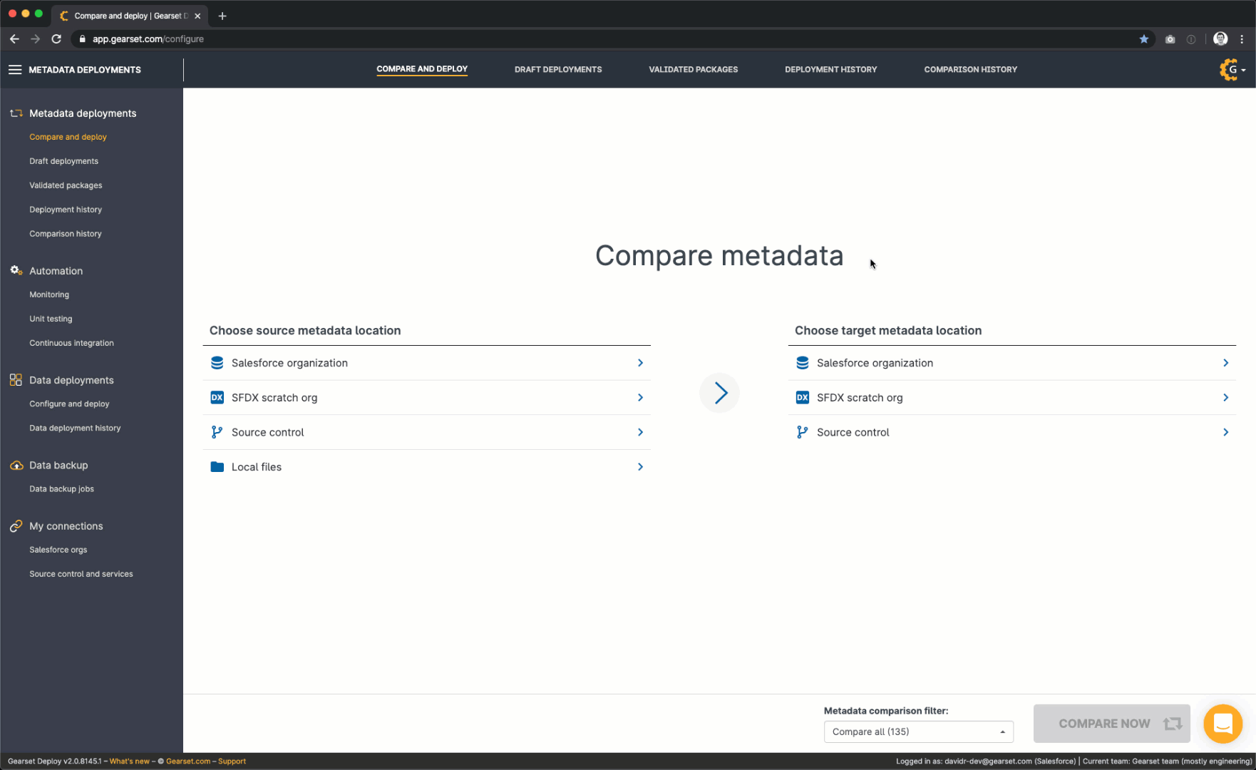
View reports on your team’s comparisons and deployments in Gearset
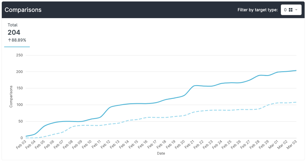
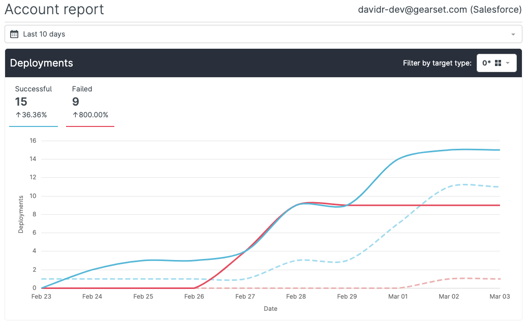
On the Reporting page you’ll find two graphs: one for deployments, and one for comparisons. These graphs show whether your team is managing to run more comparisons and deployments over time.
There are likely to be ups and downs in your graph’s curve that reflect the pattern of your release cycle. This can make it harder for you to get an accurate sense of your team’s progress. So we’ve added a dashed line that shows your team’s performance over the previous period, for comparison. You can customize the period shown in the graph so that it matches your release cycle, or you can use one of our presets. By default, the graph shows 10 days. Selecting ‘All time’ will let you see just how far your team has come since you started using Gearset.
The deployments graph also shows the number of failed deployments. If you’re deploying more often, don’t panic if the number of deployment failures is also going up - this is normal. It’s more important to track the proportion of your deployments that are failing. In other words, you should check that the blue line outperforms the red. If it doesn’t, our customer success wizards 🧙♀️ are on hand to help you turn those failures into successes - just get in touch via the live chat!
Virtual Summit: Taking control of complex orgs
Dig into the details of your reports
When you hover your cursor over the graph, a tooltip shows you the exact data for each point in time. There’s also a Target type filter with cumulative settings, so that you can see data for one or more specific types of target environment. Which environments are you comparing and deploying to most often? Are there particular kinds of environment that are causing more problems than others? The Target type filter will help you find out.
The Date range filter can be used to choose the period shown in the graphs (this filter applies to both graphs together). The two filters can be used in combination to hone in on the exact dataset you’re interested in, depending on your release schedule and release process.
If you want to see even more configurability or extra features on this page, let us know! You can use the live chat on this page, or head over to our feedback forum.
Is it time for an upgrade?
A lot of teams are in the dark about their performance when it comes to Salesforce deployments. Teams using Gearset were already ahead of the game, because Gearset automatically generates a detailed audit trail of everything you do. And now the Reporting page provides additional insight into your team’s performance, at a glance. See how increased visibilty could help your team improve with a 30-day free trial today, which includes all of our deployment and reporting features. Or book a consulatation with one of our DevOps experts to get a tailored demo.
