
When it comes to the design, implementation, and release process, life’s been a whole lot easier working on Gearset than perhaps any previous project. There’s been no single defining moment, but if you asked me to pick the most significant of the contributing factors, I’d have to go for the involvement of users earlier in the design process.
This was facilitated — or, as it turns out, supercharged — by using Slack to create external channels where users can hang out, talk, and discuss features or challenges. So, how did early user involvement helped?
User-driven development of Gearset’s metadata comparison feature
The initial release of Gearset enabled users to choose which organizations to compare, perform a full comparison, and deploy their chosen changes. With this release, we’d taken the first step towards our goal of making Salesforce deployments quicker, safer, and easier — so far, so good. Positive feedback from users confirmed we were on the right track, but something else was also clear: that this “one size fits all” approach didn’t always meet requirements or fit with users’ workflows. Full comparisons can take a long time, and they’re often not even necessary for the user’s purposes.
Benj, one of the Salesforce MVPs we work with, highlighted the issue: “Doing the initial deployment can take a really long time (many minutes). Would love to speed this up. If I know I’m focused on specific metadata, let me choose to limit the comparison to only those types. E.g. ‘Compare only: Apex Classes, Triggers, Visualforce pages.’”
This initial post triggered a deeper conversation about what such a feature might involve, and how it could fit in with the existing design. Meanwhile, we received an email from another user raising the same issue of having to perform a full comparison when he didn’t want to: “Allow the option to display only a specific metadata type. I may only want to see what Visualforce Pages are different. Why waste all that time comparing ALL of the files?”
Reading this email, we realized that if we implemented the previous user’s suggestion to enable selective comparisons, we’d be improving another aspect of the application at the same time: not only would the comparisons be quicker, but with fewer items being compared, there’d be less noise on the results page, allowing users to find what they wanted more easily – a win-win situation.
By this point, we were beginning to get an idea of what the feature might look like. We understood that it would solve major pain points for our users, and we knew it would be technically feasible to implement within a short timescale.
Design, iteration, and implementation
After a preliminary discussion about how to implement the selection feature, we decided to go for a lightbox-style format. We put together an initial mockup and shared it for review:
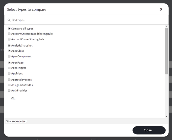
As we’d hoped, feedback arrived almost instantly: “I like the lightbox option; emphasizes that normal flow is a full comparison, but this exists as a way to customize when you want to. And once you’ve made a choice, show that choice on the main page. Since there are so many metadata types, would be great to show them in columns or a grid to reduce scrolling.”
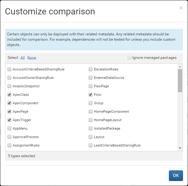
Another user also responded to the design, suggesting further improvements: “Allow the option to display only items that have been modified after a specific date/time (or between two dates). For example, just show me those files that have been changed since 2/15. Allow an option to ignore code from managed packages. Or, conversely, to display only files with a specific namespace.”
And one user highlighted a potential pitfall that the new feature would introduce if we weren’t careful. Because of dependencies, some items can only be deployed along with their related metadata. Therefore, users would need to bear this in mind when choosing what to include at the comparison stage: “It wouldn’t hurt to display an alert message for certain combinations, eg. custom objects is selected by default, and if you deselect it then warn that ‘Gearset will not test dependencies unless you include custom objects.’”
Taking this feedback into account, we were able to start tweaking the initial design. We placed the items in columns to help reduce the amount of vertical scrolling. We also included the option to ignore managed packages, and added a reminder about including related metadata types. Here’s where we got to:
Within a matter of days we’d designed, iterated, and implemented a new feature — all thanks to the strong communication channels between our development team and our users. It certainly beats developing and releasing a feature only to find that it doesn’t help anybody or that you’ve overlooked something critical.
Working with users to build solutions
Since these early days of designing what would become a core part of the Gearset platform, plenty has changed. But working closely with our users hasn’t. In fact, we’ve widened the number of ways users can guide the direction of our product, including our Feedback Forum, our DevOps Leaders program, and more besides.
Sound like the kind of team you’d like to be a part of? Take a look at our latest roles, and be part of the exciting growth journey we’re on.